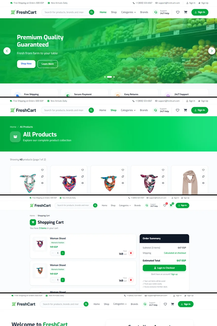
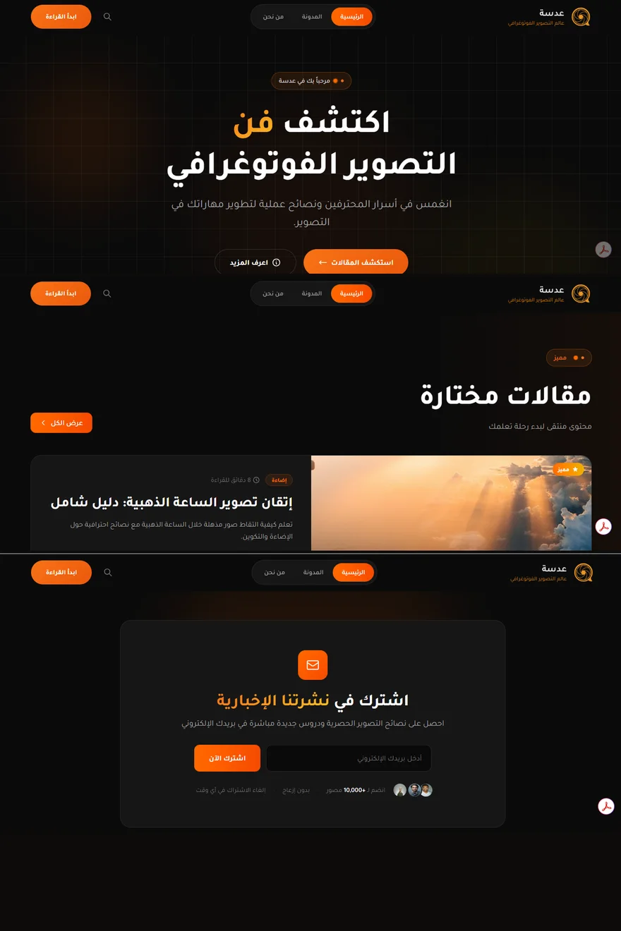
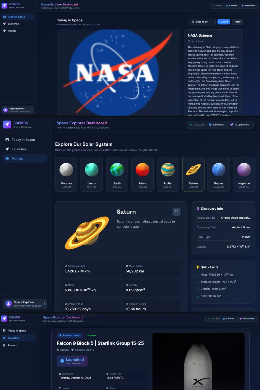
Why Your Website Must Work Perfectly on Mobile
For most businesses the phone is the first — and often the only — screen a customer uses. A site that merely shrinks isn't the same as a site built for it.
01 / 04
The first impression happens on a small screen
People find businesses through social media, messaging apps and search on their phones. If the first screen is cramped, slow or hard to tap, they leave before they ever read what you offer — and you never find out they visited.
That's why the best websites today are designed mobile-first: the phone layout is planned first, then expanded for tablets and laptops, rather than squeezed down at the end.
02 / 04
What usually goes wrong
These are the problems that most often turn mobile visitors away:
- Text too small to read without zooming, or lines that run off the screen.
- Buttons and links so close together that the wrong one gets tapped.
- Huge images that make the page slow on mobile data.
- Menus that don't open properly, or pop-ups that cover the whole screen.
- Forms that are painful to fill in with a phone keyboard.
03 / 04
What 'built for mobile' really means
A truly responsive site rearranges its layout for each screen size, keeps tap targets comfortably large, loads images sized for the device and keeps the main action — call, message, buy, book — within easy reach of the thumb.
Speed is part of it too. Google measures real-world experience with Core Web Vitals: how fast the main content appears, how quickly the page responds to a tap, and whether things jump around while loading.
04 / 04
How to check your own site in five minutes
Open your website on your own phone, on mobile data rather than Wi-Fi. Try to do the one thing a customer should do — send a message, find a price, place an order. If anything feels slow or awkward to you, it feels the same to your customers. That list is your starting point for improvement.
Keep reading
2026-09-30
Building an Arabic & English Website the Right Way
Translating the words is the easy part. A bilingual website feels native only when the Arabic version is laid out, typed and navigated the way Arabic readers expect.
2026-09-26
From Figma Design to Live Website: What Happens in Between
A design shows how a website should look. Turning it into one that works on every screen, with real data and real interactions, is a craft of its own.